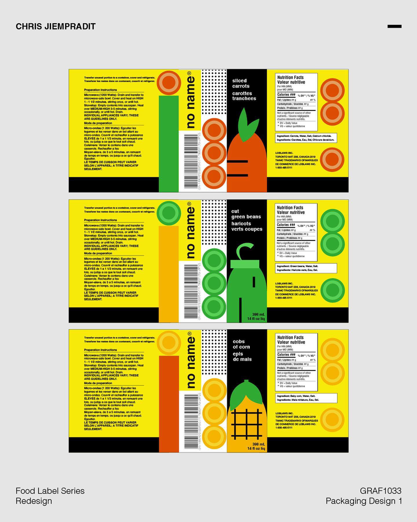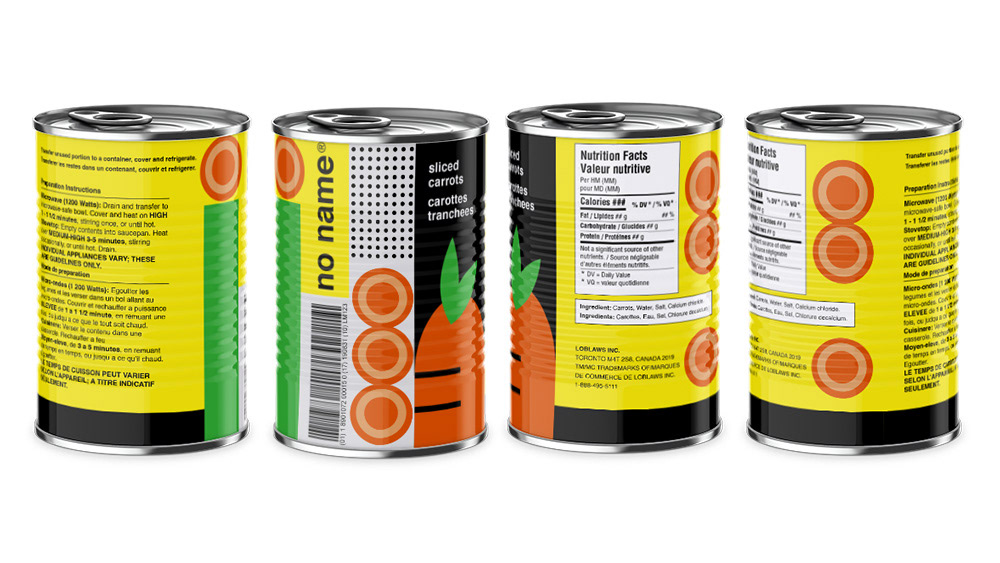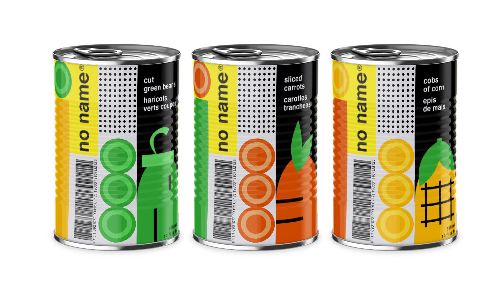
NoName Redesign for Stressed-in-Suburbia
In this project, I aimed to revamp the packaging for no name, a generic brand of grocery and household products sold by Loblaw Companies Limited, Canada's largest food retailer. The brand is known for providing high-quality items at an affordable price. The redesign focuses on simplicity, aligning with the brand's accessibility and relatability, while utilizing clean and innovative packaging designs to stand out in the aisles.
The target audience is "Stressed-in-Suburbia," a group often juggling busy lives and looking for quality products without breaking the bank. The challenge is to assure them that affordability doesn't mean compromising quality. The packaging features simple illustrations and a limited color palette to set the products apart from competitors and appeal to shoppers.
This project addresses the needs of suburban residents who are empathetic, information-seeking, and environmentally conscious. They make emotional decisions and value ethical considerations. The design's goal is to convey that affordable, high-quality products can coexist. The typography, art, and color scheme create a cohesive and noticeable brand presence on the shelf.